
Paul Clifton mail

For this assignment, I designed an interactive map that depicts uncommon or unfamiliar information about a space. By this, I mean information about a space that is not readily represented on most maps of the same space, such as pollution levels, historical events, personal stories, or simply the overlooked details of a given space such as sewer grates or cracks in the pavement. My map visually represents a space and displays three object types within that space. It includes both a macro and micro view of the space and a detail view of the specifics of each object.
This project developed my ability to select images, organization information, and display spatial information, through the use of typographic elements, framing, and structure. I also learned and applied a solid understanding of the interactive capabilities of Flash.

I first came to this project while thinking about containers. I had been thinking about physical space and the boundaries placed in and on it, and had determined that, depending on how one describes it, any physical space can be thought of as a container, either for objects or other spaces. Normally, we think of houses as containers for people, furniture, or appliances, which don't usually make very interesting maps; however, each of the objects in a house, for the most part, serves a purpose, and the purpose of an object is something that is interesting.
I have also, over the last year and half, become more and more aware of my day to day activities that consume natural resources and have tried to become conscious of ways to minimize my personal consumption. I have often found myself wondering how much water I actually use in the shower or how many tubes of toothpaste I use in a year. I realized that, while at home, my resource consumption is generally relative to my location with respect to the location of the objects in my house. Whether I am in the shower or in front of the TV is an important factor in how much and what type of resource I consume. But I am not the actual consumer of resources; I am consuming the products of resource consumption. It's the appliances that actually use the energy, and they have a very definite location in space, something that can be mapped.
The combination of these thoughts led me to the idea of creating a map that shows the relative resource consumption of the appliances in my house and that leads others to think about the resource consumption of their houses and possibilities for conservation. In Peter Hall's article, "Critical Visualization," Hall cites Colin Ware's statement about the advantages of visualization: ". . . it helps us comprehend huge amounts of data; it allows us to perceive emergent properties we might not have anticipated; it can reveal problems with the data itself; if facilitates our understanding of large-scale and small scale features; and it helps us form hypotheses." My map, as I had conceived it, visualized the relative consumption of three different resources, water, electricity, and gas, and the way I chose to represent the data would determine its effectiveness. I chose to set the size of circles based on the units of consumption. This enables the user to almost immediately to separate types of data and draw conclusions about the range of the data represented. It shows the user that some appliances use extremely disproportionate amounts of energy, and it leads to user to the idea that by reducing the consumption of the appliances that use the most energy, consumption could potentially be cut drastically, a hypothesis that any individual could test on his own.
The design of the interactivity played a key role in effectiveness of my map. As W.J.T. Mitchell states in his essay, "What Do Pictures 'Really Want'", images, want power, and they attempt to attain it by "want[ing] to be seen, [not] want[ing] to be seen, [or being] indifferent to being seen." Mitchell explains these desires through different power relationships they create. Images that want to be seen gain their power by grabbing the gaze of the viewer. Images that don't want to be seen take power by essentially looking back at the viewer and becoming the gazer. Images that are indifferent to being seen subject the viewer to a sense of voyeurism, where he is aware that he is looking at something that is not aware of his gaze. Elements of my design play on each one of these levels, increasing the poingancy of its statement. It is there to be seen. The visual elements, mainly the background image and the spots that represent each appliance, beg to be looked at and explored. The interactive element literally looks back at the user by following his interactions and reacting to them. Interactivity inherently gives images an element of power that images had not previously known due to its apparent reciprocal gaze. This power is enhanced by obscuring the base map and the information about each data point until the user interacts with it, similar to Stamen Design's project, 16th and Mission. My map also invokes a sense of voyeurism, and thereby reflexivity, by using images of my roommates in the house underneath the appliances, which are only revealed through interacting with the map. A user, by exploring our lives in our house, is called to reflect on his life in his house, and about how his location in space relates to his resource consumers.
My final product, although originally conceived as the basis for a tool that anyone could use to plot his own energy consumption, ended up being very personal, in the vein of Denis Wood's maps of his neighborhood in Raleigh, but it is more powerful because of this. A sterile map onto which anyone could add his own data, would lose an element of intimacy and detract from the sense that it reflects my actual life. These colored circles are items that I interact with on a daily basis, and by mapping them as abstract data, I have developed a novel view of what it means to be a person in a house.

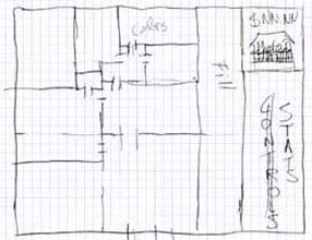
After fleshing out my concept, I started to lay out my design on paper. The first step was to sketch the floor plan of my house to make sure I properly understood the layout of the main element of my design. Once I had the sketch, I began to think about where on my map I could place relelvant information, which is also visible on my sketch.
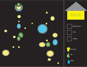
Once I had a general idea, I made a mock up in Illustrator showing how I intended to represent different types of information. I picked colors to represent the types of energy consumed, a font that I thought related to energy consumption, and designed a key that I hoped explained my thoughts well enough. I took these mock ups to class for a critique and received many good suggestions, including the idea to use actual icons to represent appliances in the detail view and help with what colors seemed appropriate.
The next step was to move into Flash and add the interactive elements of my design. I started small with just one object, and hard coded the text that it needed to display; however, I quickly realized that I would need to figure out a better way to code the data so that I could use it in calculations and change the displayed information more dynamically. I encoutered problems in this stage while trying to treat each appliance as an object in my code, but eventually learned how to store information in an XML file and reference it from within Flash to get the kind of interactions and data representations that I wanted.
Once I had the skeleton of all my code finalized, I just had to add all of the appliances to the map, take pictures of all my roommates in our house and add them to the map, then tweak the design until it was clear and effective, a part of the process that is much easier said than done.
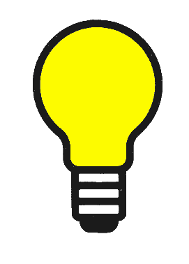
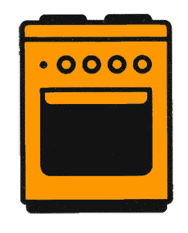
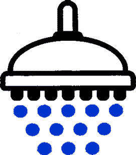

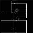
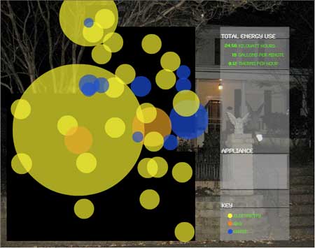
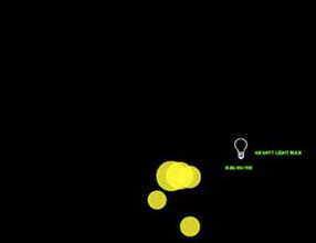
My map opens with a view of the floor plan of my house to make sure that users understand what they are looking at after it fades away. An oddly shaped black box with dots on it does not necessarily scream I'm a house to someone who hasn't been thinking about houses and appliances for several weeks. Once the floor plan fades out, the user sees the shape of my house with about 30 dots on it. Each dot represents a different appliance in my house, from light bulbs to a washing machine, and the color of each dot shows what kind of resource it consumes, which is described in the key in the lower right.
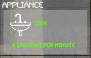
When the user places his mouse over a dot, the appliance and its individual resource consumption displays above the key. I added a layer of additional oppacity to the information display area to show that, although the area is empty, something will appear there.
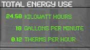
When the user clicks on the dot, it turns the appliance off and subtracts its resource consumption from the appropriate total in the upper right.
The size of each dot is set using a simple normalization function based on the range of units for each type of resource. It is worth noting that the sizes of the dots do not relate across resource type.
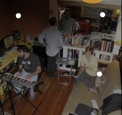
As the user turns appliances off, he begins to uncover the micro-view that shows the life in my house. When he places his over a part of a room that is not coverd by an appliance, an image of my roommates in that room displays. This depicts how we relate to the nodes of resource consumption in our house and how our lives in some senses revolve around the interactions we have with these items.
The background image is a photograph of my house at night, which gives the user another angel from which he can understand what the map is showing. The font is Syncro from Letraset which is made up of dots and rounded lines giving it the appearance of being created by a matrix of lights as if it were an appliance itself.